Visualizing Polar Bear Population in Relation to Climate Change
How might interactive data visualization help people better understand the impact of climate change on polar bear populations?
This project explores an interactive 3D data visualization that illustrates the relationship between polar bear population changes and Arctic climate change. By bringing together multiple datasets into a single interactive environment, the visualization aims to help viewers better understand how environmental shifts affect wildlife in the Arctic.
Through an interactive timeline and a navigable 3D view, users can explore population changes across different years and examine the data from multiple perspectives. This approach encourages viewers to actively engage with the information and gain a clearer understanding of the severity of climate change’s impact on polar bears and their habitat.
Understanding the Limitations of Existing Climate Data Visualizations
Why are many climate data visualizations difficult for general audiences to interpret?
The Polar Bears International website presents a large amount of information related to polar bear populations and Arctic climate change, including yearly population numbers and monthly Arctic ice volume data. While this information is valuable, it is primarily communicated through charts and numerical datasets, which can be difficult for general audiences to interpret quickly. Without visual context, it can be challenging for viewers to understand what these numbers represent or how environmental changes impact polar bear populations over time.

Gathering Data on Polar Bear Populations and Arctic Climate Change
What data helps reveal the relationship between polar bears and Arctic environmental change?
To build the visualization, I collected data from Polar Bears International related to polar bear population trends and Arctic ice volume across different years. These datasets formed the foundation of the project. By combining this information into a single interactive visualization, viewers can explore the data more intuitively and compare changes over time, making it easier to understand the severity of environmental changes occurring in the Arctic.

Translating Environmental Data into Visual Form
How can climate and wildlife data be represented in a clear and engaging way?
Using the collected datasets, I explored how the information could be translated into a spatial and interactive visualization that simplifies complex data relationships.

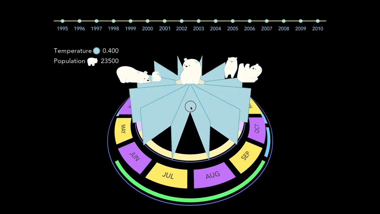
Polar Bear Population
The polar bears on top of the ice berg each represent a number and adds up to the population data given per year.

Ice Berg Volume
The height of the top, outer points of the ice berg represents the ice berg volume each month labeled on the bottom.

Arctic Average Temperature
The color of the ice berg represents the arctic average temperature each year. The color turns brown from blue when the temperature gets warmer.